A more human Health Insurance
A user-centered experience strategy for Providence Health Plan, transforming complex insurance shopping into a guided, stress-free journey.
Role:
On Site Discovery
Client:
Providence St. Joseph
Company:
SoftServe
Date:
May, 2025
Involvement time:
1 month
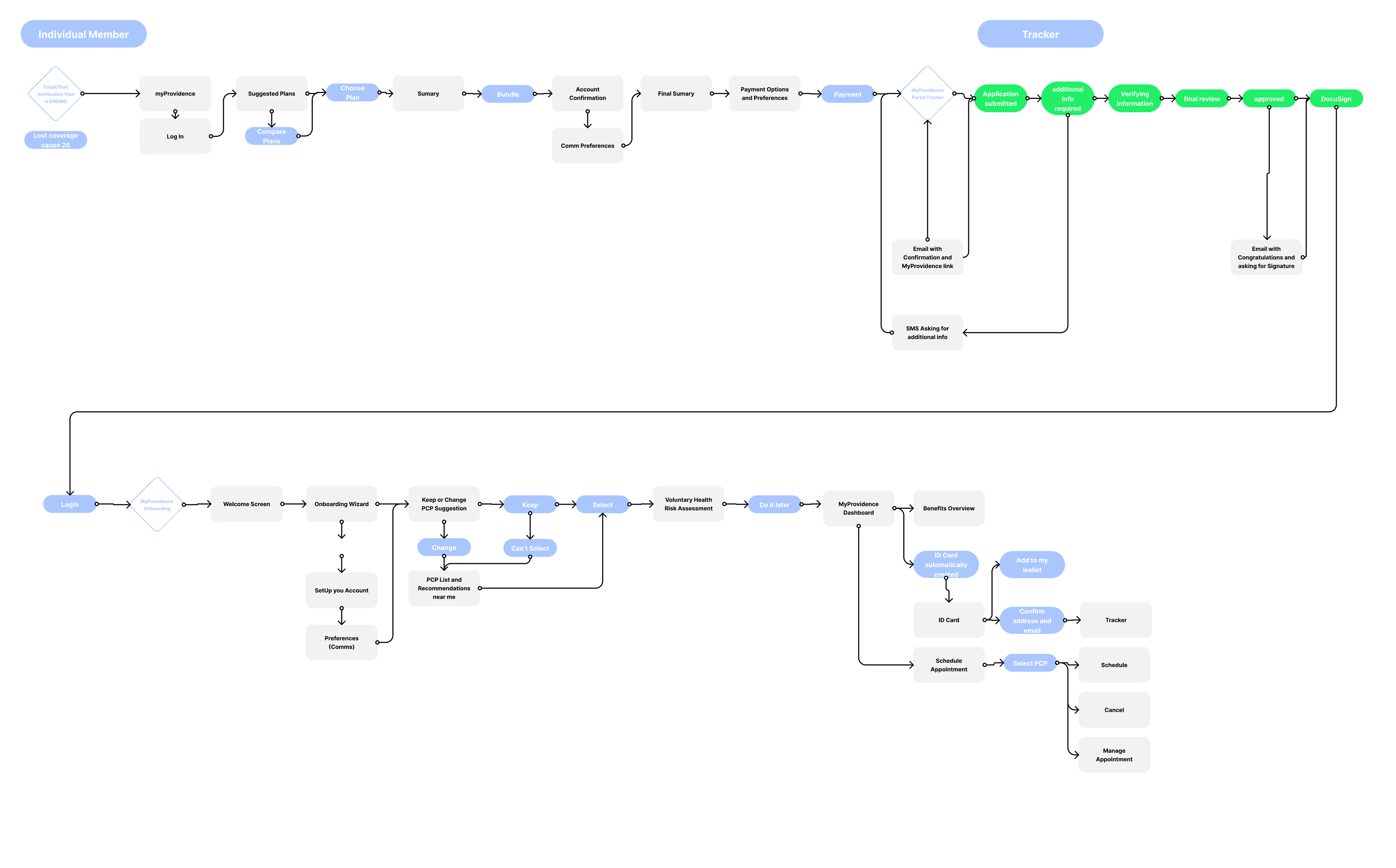
This project was all about taking the "clinical" out of health insurance and making it feel accessible and supportive. The entire strategy was built on a foundation of extensive business analysis and user understanding conducted during an on-site visit to Portland, Oregon. We didn't just design screens, we mapped out a path for people like Michael, a recently divorced freelancer, seeking stability in a transitional period.


Research Process
Our research focused on the "New Individual" journey. By being on-site in Portland, we were able to observe exactly how users like Michael navigate the friction of losing employer-sponsored coverage and hunting for a plan that offers both security and convenience. We identified that the shopping phase is the highest point of anxiety, which led to our focus on a guided, pilot shopping experience.

Wireframes
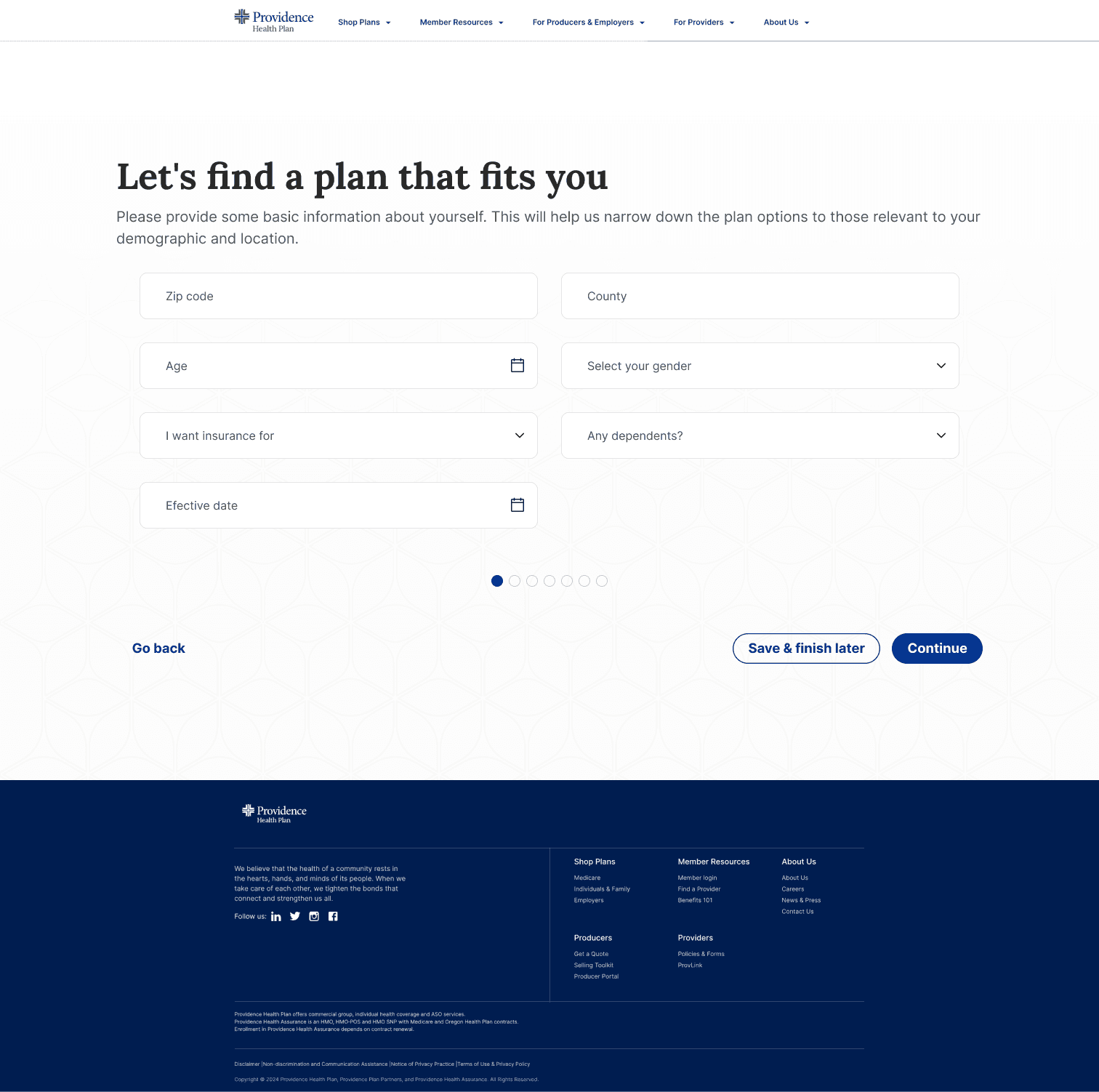
The wireframe phase was about creating a Guided Plan Selection that felt conversational rather than transactional. I designed a clean, dynamic interface that broke down overwhelming choices into simple steps:
Self-Identification: A responsive layout that narrows down options based on basic demographic data.
Care Priorities: Using clear iconography and simple descriptions to let users check off what actually matters to them, like mental health or wellness programs.
Budgeting: I implemented a simple slider tool to help users find their financial "comfort zone" without the usual insurance jargon
Proposal
The core of our proposal was Transparency and Tailored Recommendations. Instead of dumping a list of 50 plans on the user, we proposed a "Recommended for You" engine. Each plan included a concise summary explaining why it was a fit. We also pitched a Seamless Enrollment alternate scenario, where users could save their progress and resume later via a "Magic Link" in their email, ensuring zero data loss during high-stress moments.

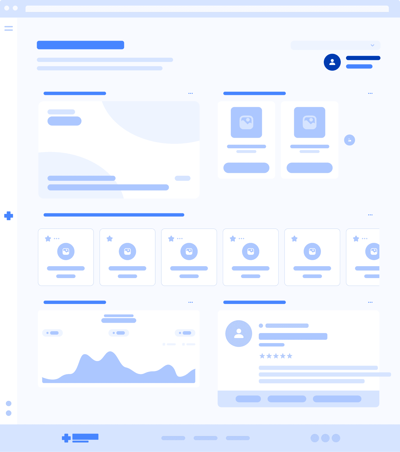
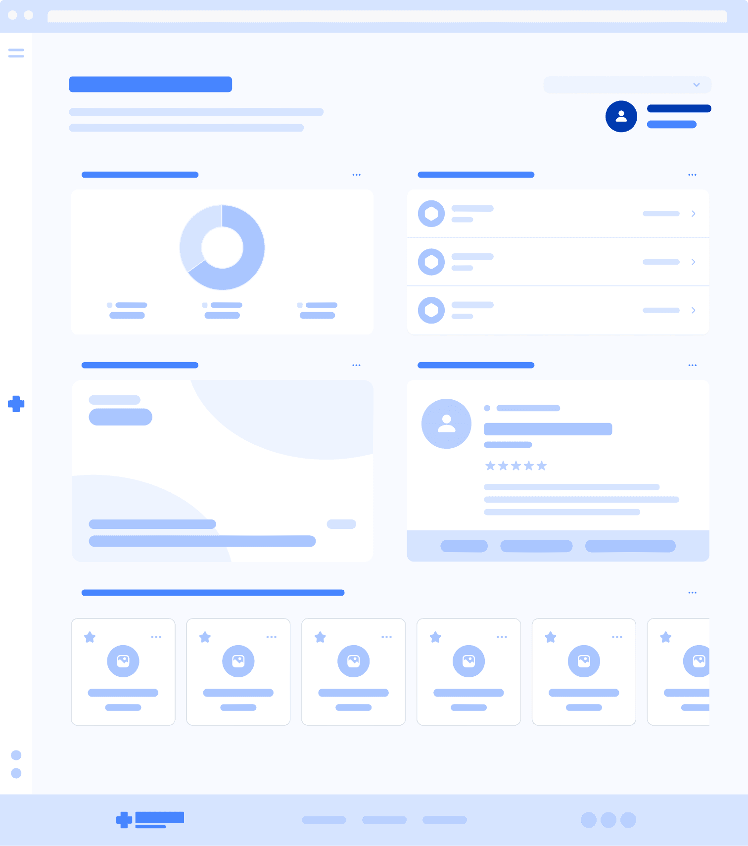
Final Product
The final experience followed Michael all the way from enrollment to his first doctor's visit. Key features included:
Guided Onboarding: A tutorial that helps users personalize their portal and set up their profile immediately.
Customized Dashboard: A personalized view highlighting the member ID card, primary care physician (PCP), and claims tracking.
Digital Integration: One-tap "Add to Apple Wallet" for the ID card and SMS appointment reminders.