Helping those in crisis
A warmer experience where people with a mental health crisis can access resources to overcome their current situation.
Role:
UI // Illustration
Client:
Company:
Huge Inc.
Date:
February, 2022
Involvement time:
4 months
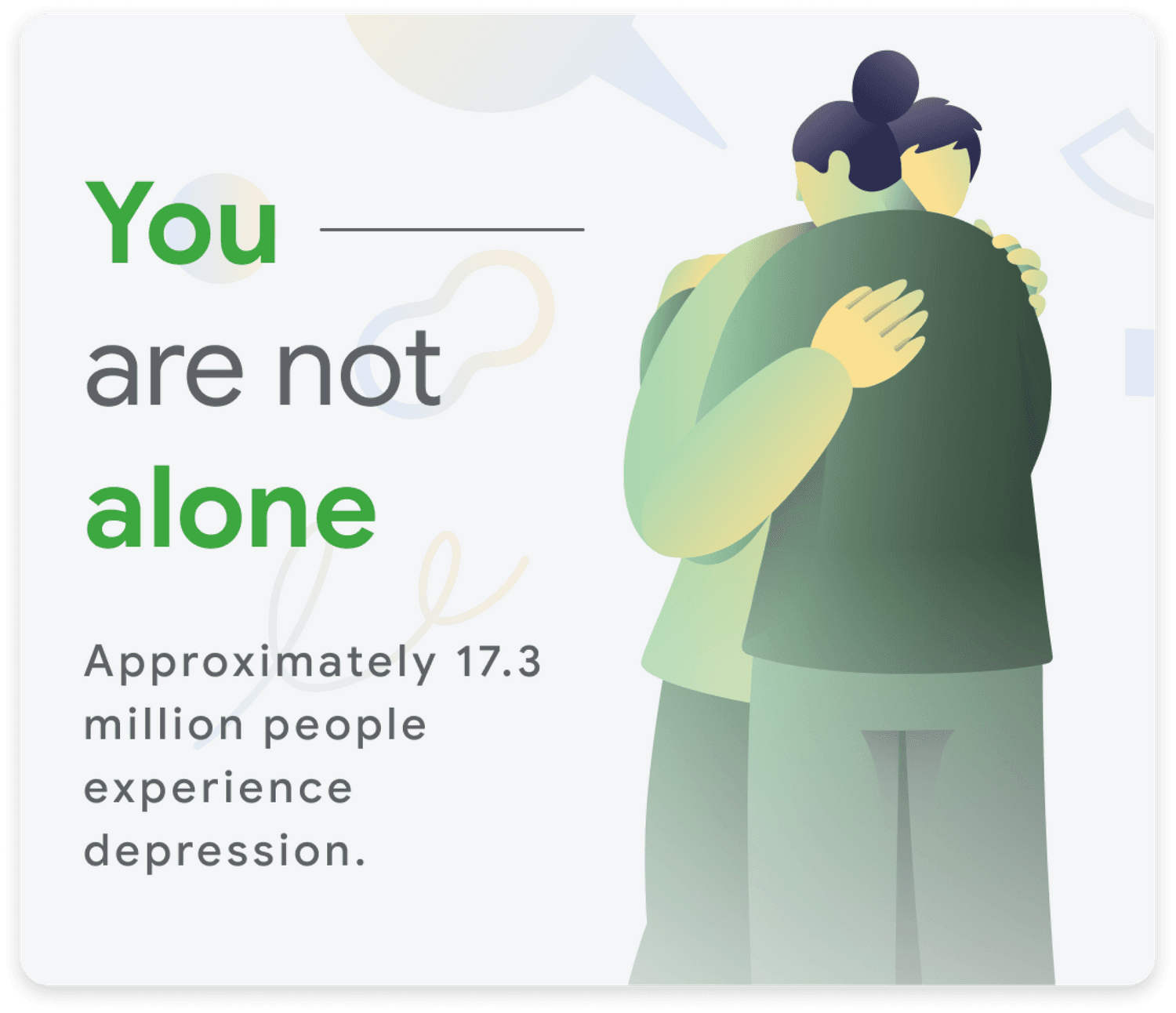
This project aims to make the current search for suicide and self-harm experience more visual, empathetic, warmer, supportive, and actionable to help users who express suicide or self-harm intents but are not yet ready to call a crisis hotline.
Illustration is a great way to kickstart the experience,with this resource we generate a feeling of closeness and soft down the whole page, thus inviting people to start the conversation.
Our final delivery was an experience that unfolds an empathetic conversation and de-escalate negative emotions through the intimacy of the UI and the closeness of the illustrations.


Research Process
Understanding that mental health is not a linear process, we conducted in-depth user research to explore how digital tools could support different emotional journeys. Key findings revealed the need for:
• Validation and normalization of emotions to help users reframe negative thoughts.
• Storytelling as a tool to foster connection and let users know they are not alone.
• Action-driven resources that provide immediate help without overwhelming the user.
These insights shaped the interaction framework, ensuring that the digital experience was empathetic, supportive, and adaptable to each individual’s needs.

Proposal
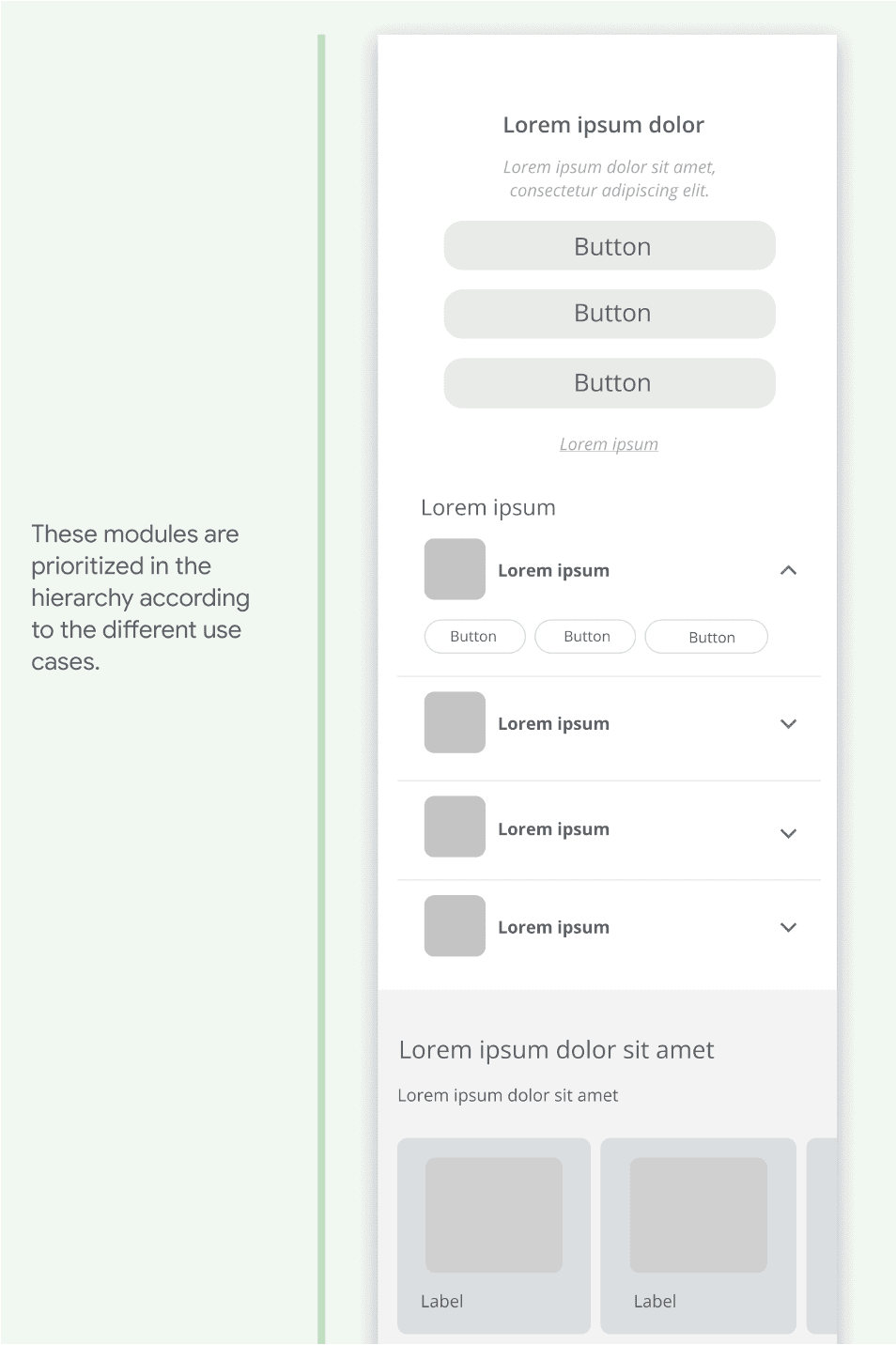
To translate these insights into a tangible experience, we structured the platform using a modular design approach. The experience was broken down into three core interaction models:
• Emotional validation: Helping users understand and process their emotions through guided interactions.
• Support network integration: Providing access to relatable stories and connections to mental health resources.
• Actionable guidance: Offering step-by-step support while allowing users to navigate at their own pace.
We developed a schematic blueprint that defined the general structure of the experience, ensuring that interactions remained intuitive, responsive, and visually engaging.
Wireframes
The wireframes were designed to map out user pathways based on their emotional state and needs.
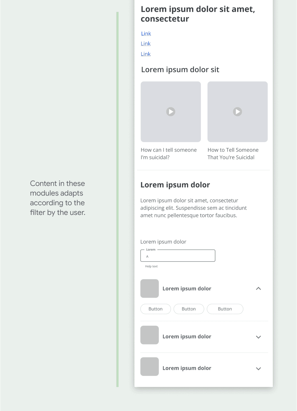
The modular structure ensured that content and primary interactions adapted dynamically, making it easy for users to explore resources without pressure. Every step was designed to reduce cognitive overload, ensuring users felt safe, guided, and supported.


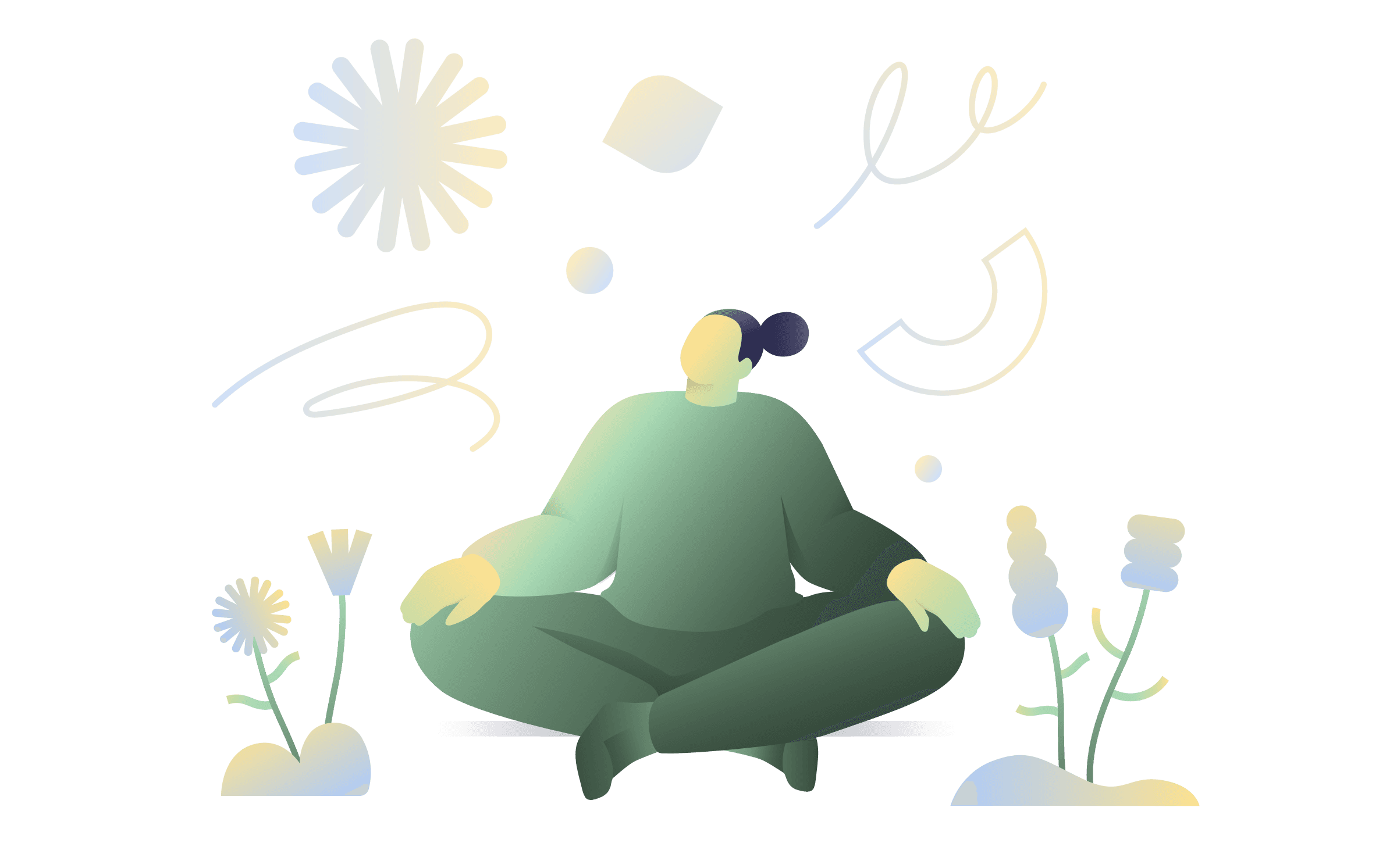
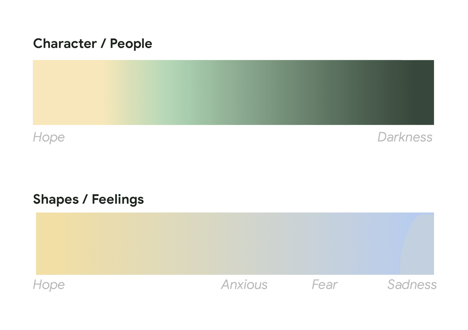
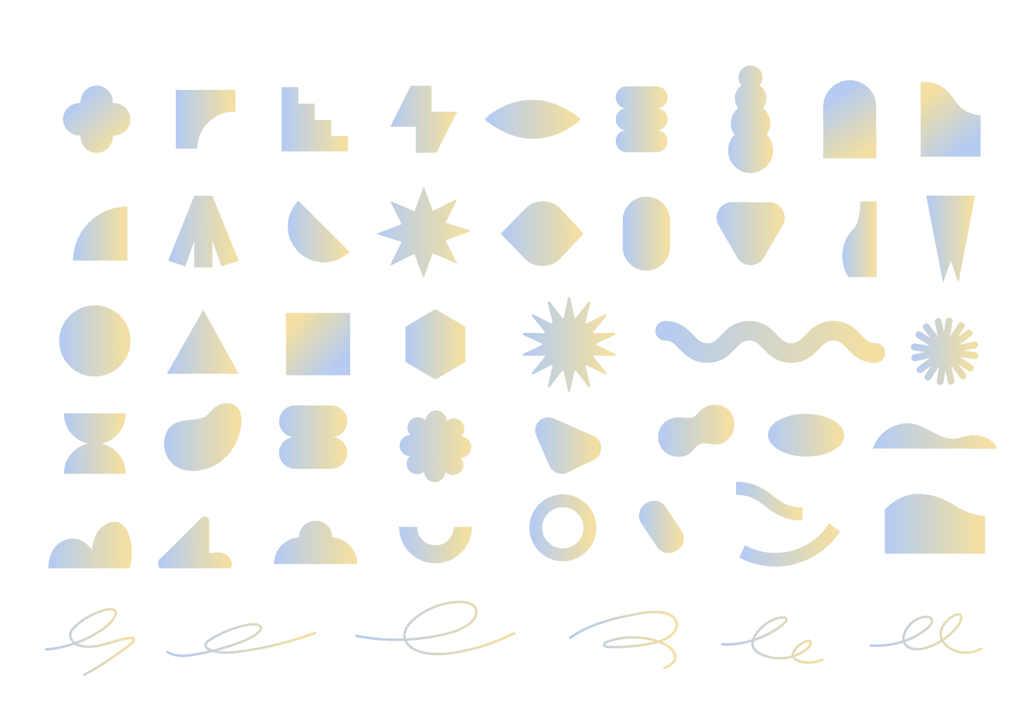
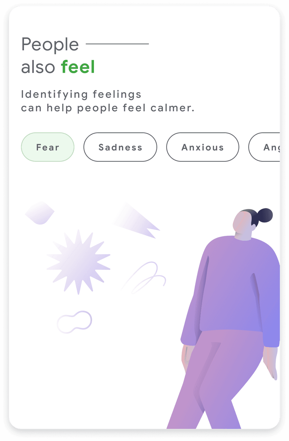
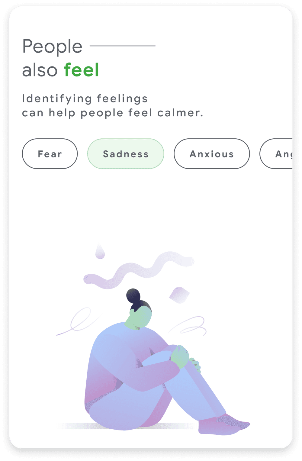
Illustration
Illustrations played a crucial role in enhancing emotional connection within the interface. We focused on soft, warm visuals that evoked a sense of safety and understanding. These illustrations were carefully integrated to de-escalate negative emotions, provide comfort, and guide users through the experience in a non-intrusive way.

UI modules
The UI was designed to be intimate and supportive, avoiding an overly clinical feel. Using gentle color palettes, rounded UI elements, and calm typography, we created an experience that felt more human-centered. We also designed interactive modules that adjusted based on user engagement, allowing for personalized guidance without forcing a specific path.


