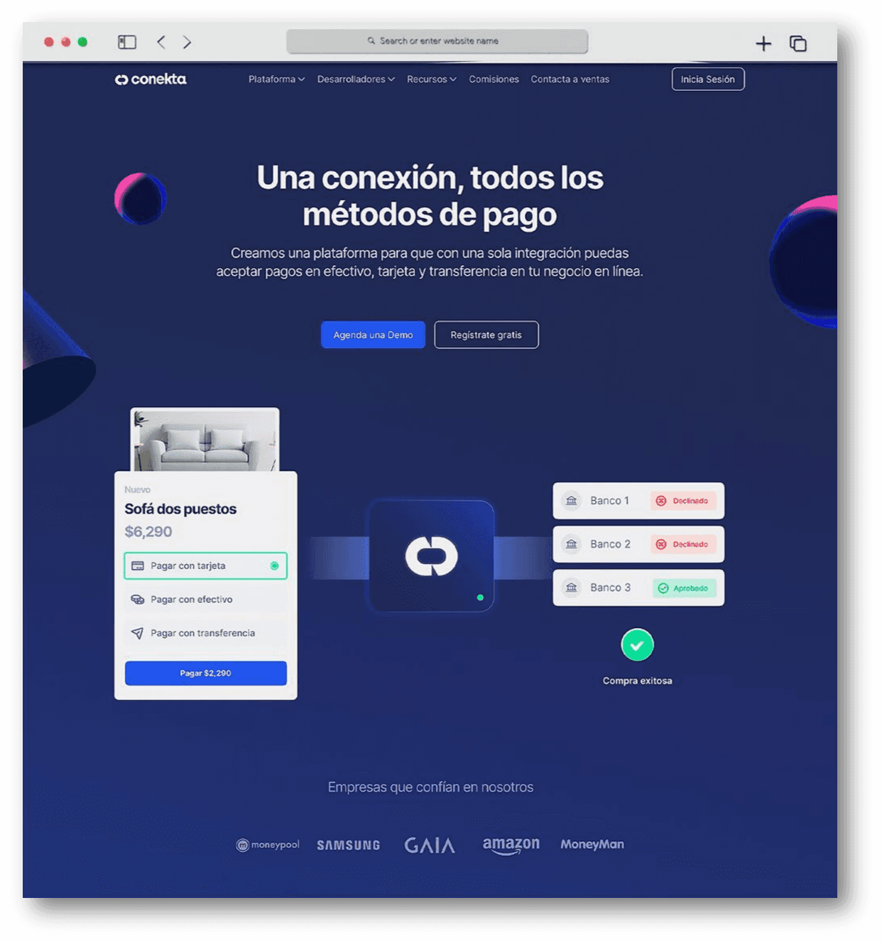
A new way to make payments
A scalable and seamless experience for a fintech future.
Role:
Web Design
Client:
Conekta
Company:
Conekta
Date:
July, 2022
Involvement time:
6 months
As part of the redesign for Conekta’s website and webapp, my role encompassed illustration, UX, and UI design, ensuring a seamless and visually engaging experience. I focused on crafting custom illustrations that aligned with the brand’s identity, designing an intuitive user experience, and developing a scalable design system to support future iterations.
Additionally, I worked on defining a component-based UI structure, optimizing efficiency and consistency across different sections of the website.

Research Process
The initial research phase aimed to define how the Conekta website and webapp could effectively communicate its services while maintaining a highly functional and engaging interface.
We analysed:
• User needs and pain points, identifying areas where clarity and usability could be improved.
• Industry benchmarks, studying best practices in fintech and SaaS website design.
• Visual storytelling, ensuring that illustrations and UI elements enhanced rather than distracted from key messaging.
Proposal
To achieve a consistent and flexible design, we proposed a component- driven approach using Atomic Design principles in Figma. Our goal was to create:
• A scalable Design System with a consistent visual language, including typography, color schemes, and UI patterns.
• Reusable UI components such as buttons, forms, navigation elements, and content blocks, making development and future
iterations more efficient.
• Illustration guidelines that ensured a cohesive and recognizable visual style across the website.
By structuring the website around these reusable components, we ensured a cohesive user experience while making it easier for the team to iterate and expand the platform over time.

Final Experience
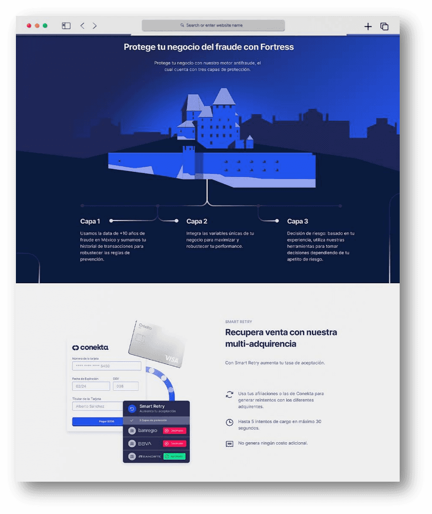
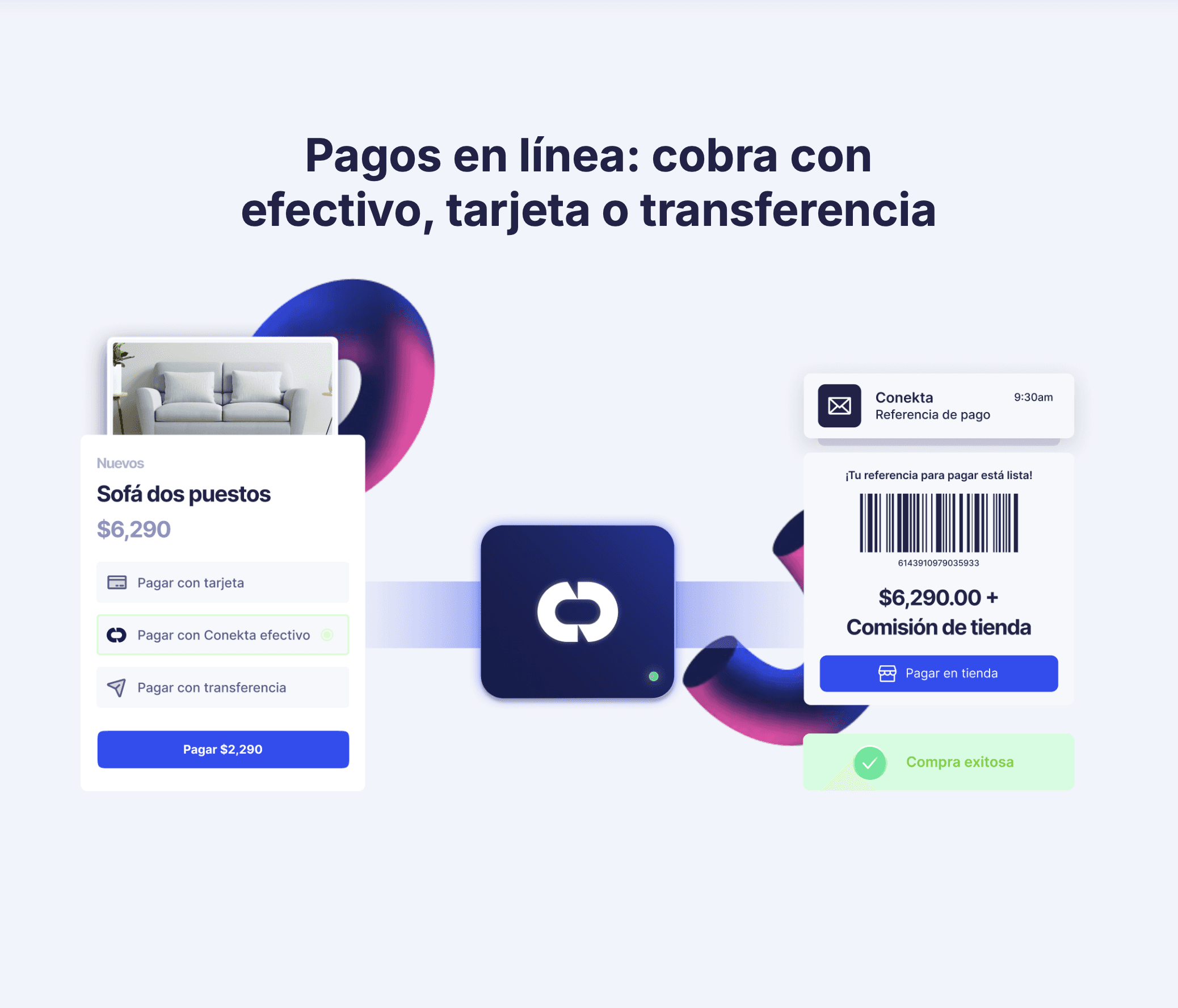
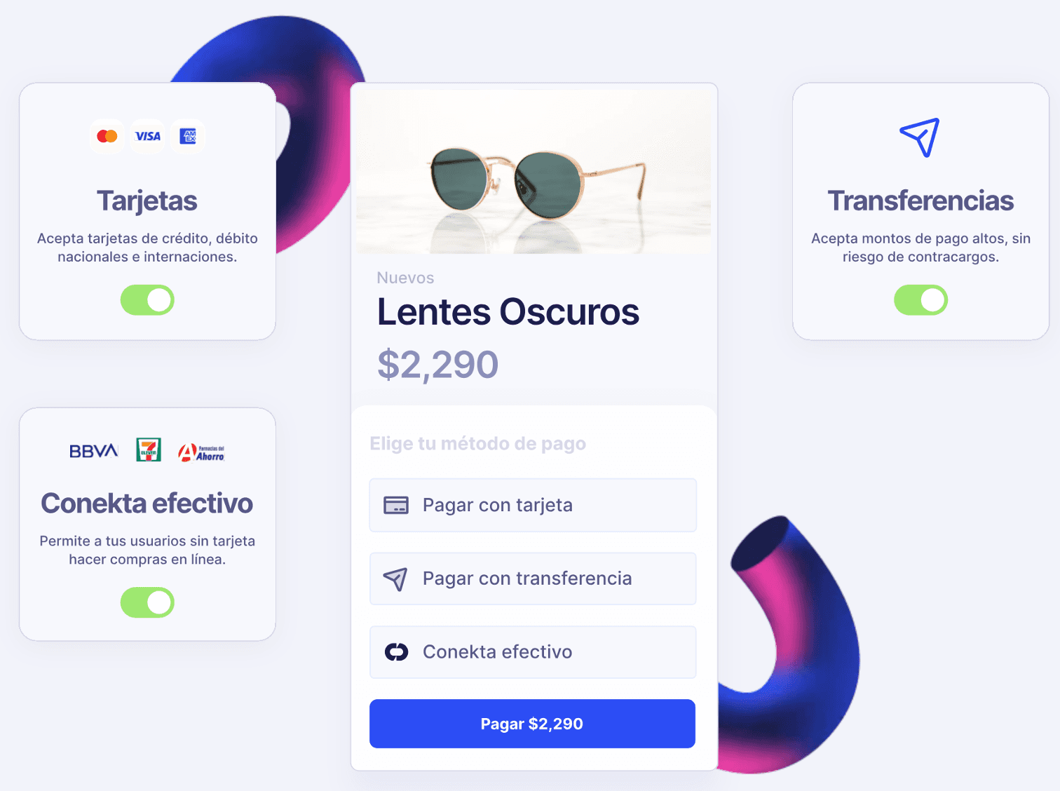
The redesigned Conekta website was built upon a strong Design System, ensuring visual and functional consistency across all pages. Components were structured following Atomic Design principles, starting with foundational elements (colors, typography, buttons, icons) and building up to larger structures (cards, forms, hero sections). A key part of this redesign was the dashboard interface, designed to provide users with a clear, intuitive, and data-driven experience. We focused on information hierarchy and usability, ensuring that users could easily track transactions, manage payments, and access insights with minimal friction.
The illustrations played a key role in enhancing user engagement, balancing a friendly and professional tone while reinforcing Conekta’s brand identity. Each illustration was designed to integrate seamlessly with the UI, ensuring that visuals complemented content rather than overwhelming it.